

📝 英文生图提示词
Create ONE finished premium conceptual typography poster for the exact title:
“[INPUT_TEXT]”
Single poster only. No moodboard, grid, presentation board, mockup, captions, prompt text, process sheet, or sample labels.
The title “[INPUT_TEXT]” must be the dominant visual structure of the poster: huge, readable, powerful, and spelled exactly. Do not translate, shorten, replace, or misspell it. Do not add other large readable text. Optional micro catalog text is allowed only if it stays subtle and secondary.
Silently interpret the title’s meaning, mood, cultural aura, symbolic associations, psychological tension, and visual rhythm. Turn that interpretation into one strong visual metaphor.
Typography is the hero. Design custom-looking letterforms whose weight, width, contrast, spacing, rhythm, distortion, negative space, edge quality, and ink texture express the temperament of the title. The type should feel intentionally designed, not like a default font.
If “[INPUT_TEXT]” refers to a widely known person, make a large editorial portrait or full / half-body figure a major visual presence, occupying roughly 40–70% of the composition. The figure should feel recognizable through aura, posture, styling, era, expression, lighting, and symbolic atmosphere, but should not copy a specific existing photograph, official poster, campaign image, logo, slogan, or copyrighted composition. The portrait must interact with the typography: overlapping the letters, emerging from them, being framed by them, casting shadows on them, breaking through them, or being partially hidden behind them.
For all other titles, use a human figure, landscape, object, or atmospheric setting only when it strengthens the meaning. It must interact with the typography and deepen the concept, not decorate it.
Use a rich but restrained 4–6 color system matched to the theme: dominant background color, primary typography color, figure / landscape tone, emotional accent color, muted support color, and subtle paper / ink texture tone. Avoid flat black-white-red defaults unless conceptually necessary.
Composition style: high-end editorial poster, museum-quality graphic design, dramatic scale, strong hierarchy, few elements, intelligent whitespace, bold flat color areas, sharp cropping, silkscreen / lithograph / risograph grain, paper fibers, subtle ink imperfections, refined visual tension.
The final image should feel like a complete visual sentence: the title, the figure or setting, the color, and the typography explain each other.
Avoid generic word art, glossy 3D lettering, random icons, stock-photo realism, cluttered collage, excessive grunge, tourist clichés, official logos, copied slogans, copied campaign aesthetics, unrelated text, and misspelled typography.
INPUT_TEXT:Phoenix Rebirth

Create ONE finished premium conceptual typography poster for the exact title:

“[INPUT_TEXT]”

Single poster only. No moodboard, grid, presentation board, mockup, captions, prompt text, process sheet, or sample labels.

The title “[INPUT_TEXT]” must be the dominant visual structure of the poster: huge, readable, powerful, and spelled exactly. Do not translate, shorten, replace, or misspell it. Do not add other large readable text. Optional micro catalog text is allowed only if it stays subtle and secondary.

Silently interpret the title’s meaning, mood, cultural aura, symbolic associations, psychological tension, and visual rhythm. Turn that interpretation into one strong visual metaphor.

Typography is the hero. Design custom-looking letterforms whose weight, width, contrast, spacing, rhythm, distortion, negative space, edge quality, and ink texture express the temperament of the title. The type should feel intentionally designed, not like a default font.

If “[INPUT_TEXT]” refers to a widely known person, make a large editorial portrait or full / half-body figure a major visual presence, occupying roughly 40–70% of the composition. The figure should feel recognizable through aura, posture, styling, era, expression, lighting, and symbolic atmosphere, but should not copy a specific existing photograph, official poster, campaign image, logo, slogan, or copyrighted composition. The portrait must interact with the typography: overlapping the letters, emerging from them, being framed by them, casting shadows on them, breaking through them, or being partially hidden behind them.

For all other titles, use a human figure, landscape, object, or atmospheric setting only when it strengthens the meaning. It must interact with the typography and deepen the concept, not decorate it.

Use a rich but restrained 4–6 color system matched to the theme: dominant background color, primary typography color, figure / landscape tone, emotional accent color, muted support color, and subtle paper / ink texture tone. Avoid flat black-white-red defaults unless conceptually necessary.

Composition style: high-end editorial poster, museum-quality graphic design, dramatic scale, strong hierarchy, few elements, intelligent whitespace, bold flat color areas, sharp cropping, silkscreen / lithograph / risograph grain, paper fibers, subtle ink imperfections, refined visual tension.

The final image should feel like a complete visual sentence: the title, the figure or setting, the color, and the typography explain each other.

Avoid generic word art, glossy 3D lettering, random icons, stock-photo realism, cluttered collage, excessive grunge, tourist clichés, official logos, copied slogans, copied campaign aesthetics, unrelated text, and misspelled typography.

-----

INPUT_TEXT:Phoenix Rebirth
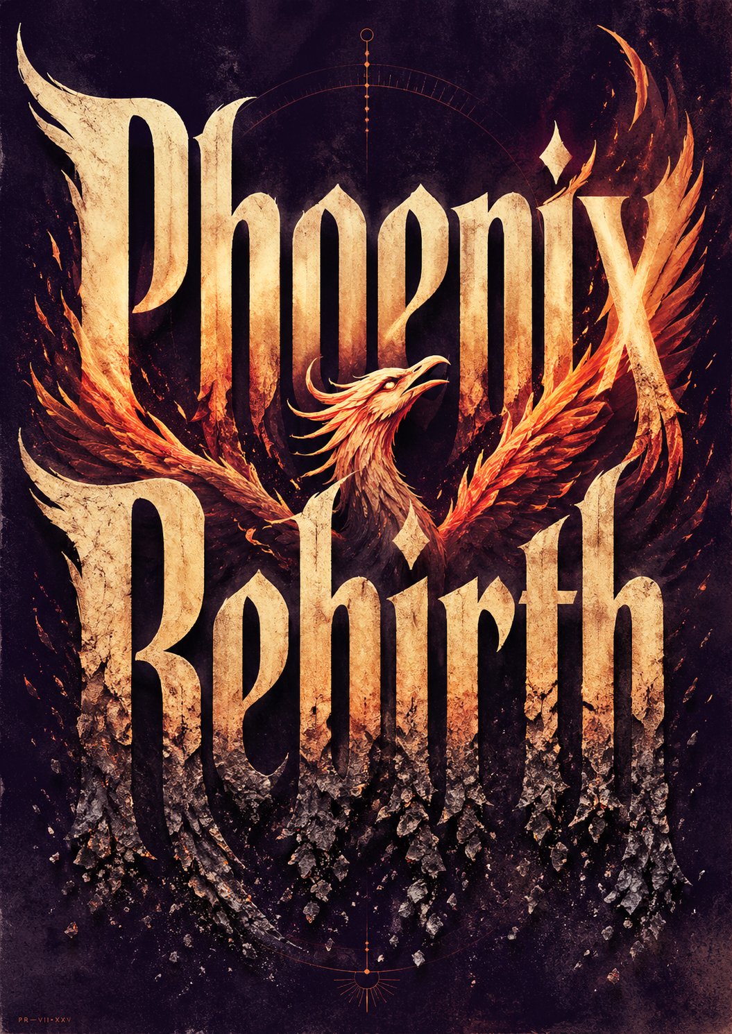
💡 提示词说明:本卡片提供高精度的 AIGC 生图咒语,点击下方 “Copy Prompt” 按钮即可一键复制原始英文提示词使用。
🔮 画面意境解析 (Prompt Translation)
AI 智能生成的艺术绘图提示词《例355 – 概念字体海报 Prompt》,呈现宏大唯美的视觉质感。
🧩 结构化咒语拆解 (Structure Breakdown)
- 主体 (Subject): 根据 Prompt 自动生成画面主体
- 环境与背景 (Environment): 根据 Prompt 自动构筑光影背景
- 画风与光效 (Style & Light): 写实 / 3D / 插画艺术风格
🛠️ 避坑与参数建议 (Parameters & Tips)
推荐使用 Midjourney v6.0 或 Flux 1.0 模型生成,建议参数 –ar 9:16 –v 6.0
🧭 文中关联 AI 工具官网与参数卡(语宙 AI 导航)
❓ 常见问题解答(FAQ)
概念字体海报 Prompt 的核心要求是什么?
核心是让标题本身成为海报的主视觉:必须巨大、清晰、拼写准确,并且只做一张成品海报,不要出现 moodboard、网格、流程页或多余说明文字。
这类字体海报为什么强调自定义字形?
因为它要表达标题的情绪、文化气质和视觉节奏,而不是套用默认字体。通过字重、字宽、间距、扭曲、负空间和材质,才能做出更像高级编辑海报的效果。
标题是人物名时,画面应该怎么处理?
如果标题对应广为人知的人物,应让人物成为画面重要主体,约占 40–70% 画幅,并与标题发生遮挡、穿插、包裹或投影关系,避免只是单独放一张头像。
🔬 语宙深潜追问 · 进阶实操拆解
字体海报怎样兼顾可读性和设计感?
先保证标题骨架清晰,再通过负空间、局部变形和材质处理增强风格。不要为了造型牺牲识别度,尤其是首屏传播场景,读得懂比“炫”更重要。
AI 生成概念字体最常见的坑是什么?
常见问题是字形装饰过度、笔画断裂和层级混乱。解决方法是把“主标题、辅助字、背景纹理”分开描述,并明确要求字面可辨识,这样更容易得到可用海报。
🗳️ 读者观点微投票 · 您的实战立场是?
概念字体海报,标题该不该直接当主视觉?


