

📝 英文生图提示词
Using the uploaded logo, create a highly detailed, comic-style infographic poster:
“What This Brand Feels Like”
Turn the brand into a living personality and visually explain how it behaves, speaks, and interacts with the world.
This must feel like a mix of: brand strategy + character design + comic storytelling.
CORE RULE:
Everything must come from the logo:
- colors
- personality
No generic personality traits.
MAIN STRUCTURE:
Vertical 4:5 poster
Dense layout with multiple panels
Comic + infographic hybrid
TOP SECTION:
- Brand name
- Short personality statement (max 6 words)
Example: “Quiet confidence with sharp edges”
MAIN CHARACTER (VERY IMPORTANT):
Create a central character representing the brand:
- humanized version of the brand
- outfit reflects brand style
- posture + expression reflect personality
AROUND THE CHARACTER:
Create 6–8 comic panels showing how the brand behaves in different situations.
SCENARIO IDEAS:
- Talking to customers
- Handling competition
- Selling a product
- Social media presence
- Reacting to criticism
- Daily “brand life” moment
FOR EACH PANEL:
Include:
- short caption (max 6 words)
- speech bubble or internal thought
- clear visual action
TONE EXAMPLES:
Luxury brand: calm, confident, minimal speech
Playful brand: loud, chaotic, expressive
Tech brand: precise, logical, clean
PERSONALITY TRAITS SECTION:
Add small labeled blocks:
- Voice tone (e.g. calm, bold, playful)
- Energy level (low / medium / high)
- Social behavior (introvert / extrovert)
- Communication style
- short labels
DO / DON’T SECTION:
Add a split block:
- how the brand should act
- what breaks the identity
- very short phrases
VISUAL ELEMENTS:
- speech bubbles
- arrows
- small reactions
- exaggerated comic expressions
- comic + editorial hybrid
- slightly exaggerated but still premium
- expressive but not childish
- strictly based on logo palette
- use color to reinforce personality
- 20–40 visual elements
- multiple small panels
- layered composition
IMPORTANT RULES:
- must feel alive
- must feel specific
- no generic marketing words
- no empty areas
- keep text short but impactful
FINAL FEEL:
- a brand strategy turned into a character
- a visual storytelling board
- something people save and study
- generic
- minimal

Using the uploaded logo, create a highly detailed, comic-style infographic poster:

“What This Brand Feels Like”

GOAL:
Turn the brand into a living personality and visually explain how it behaves, speaks, and interacts with the world.
This must feel like a mix of: brand strategy + character design + comic storytelling.

---

CORE RULE:
Everything must come from the logo:
- colors
- style
- tone
- personality

No generic personality traits.

---

MAIN STRUCTURE:
Vertical 4:5 poster
Dense layout with multiple panels
Comic + infographic hybrid

---

TOP SECTION:
- Brand name
- Short personality statement (max 6 words)
Example: “Quiet confidence with sharp edges”

---

MAIN CHARACTER (VERY IMPORTANT):
Create a central character representing the brand:
- humanized version of the brand
- outfit reflects brand style
- posture + expression reflect personality

---

AROUND THE CHARACTER:
Create 6–8 comic panels showing how the brand behaves in different situations.

---

SCENARIO IDEAS:
- Talking to customers
- Handling competition
- Selling a product
- Social media presence
- Reacting to criticism
- Daily “brand life” moment

---

FOR EACH PANEL:
Include:
- short caption (max 6 words)
- speech bubble or internal thought
- clear visual action

---

TONE EXAMPLES:
Luxury brand: calm, confident, minimal speech
Playful brand: loud, chaotic, expressive
Tech brand: precise, logical, clean

---

PERSONALITY TRAITS SECTION:
Add small labeled blocks:
- Voice tone (e.g. calm, bold, playful)
- Energy level (low / medium / high)
- Social behavior (introvert / extrovert)
- Communication style

Use:
- icons
- short labels

---

DO / DON’T SECTION:
Add a split block:
DO:
- how the brand should act
DON’T:
- what breaks the identity

Keep:
- very short phrases

---

VISUAL ELEMENTS:
- speech bubbles
- icons
- arrows
- small reactions
- exaggerated comic expressions

---

STYLE:
- comic + editorial hybrid
- slightly exaggerated but still premium
- expressive but not childish

---

COLOR:
- strictly based on logo palette
- use color to reinforce personality

---

DEPTH:
- 20–40 visual elements
- multiple small panels
- layered composition

---

IMPORTANT RULES:
- must feel alive
- must feel specific
- no generic marketing words
- no empty areas
- keep text short but impactful

---

FINAL FEEL:
Like:
- a brand strategy turned into a character
- a visual storytelling board
- something people save and study

NOT:
- flat
- generic
- minimal
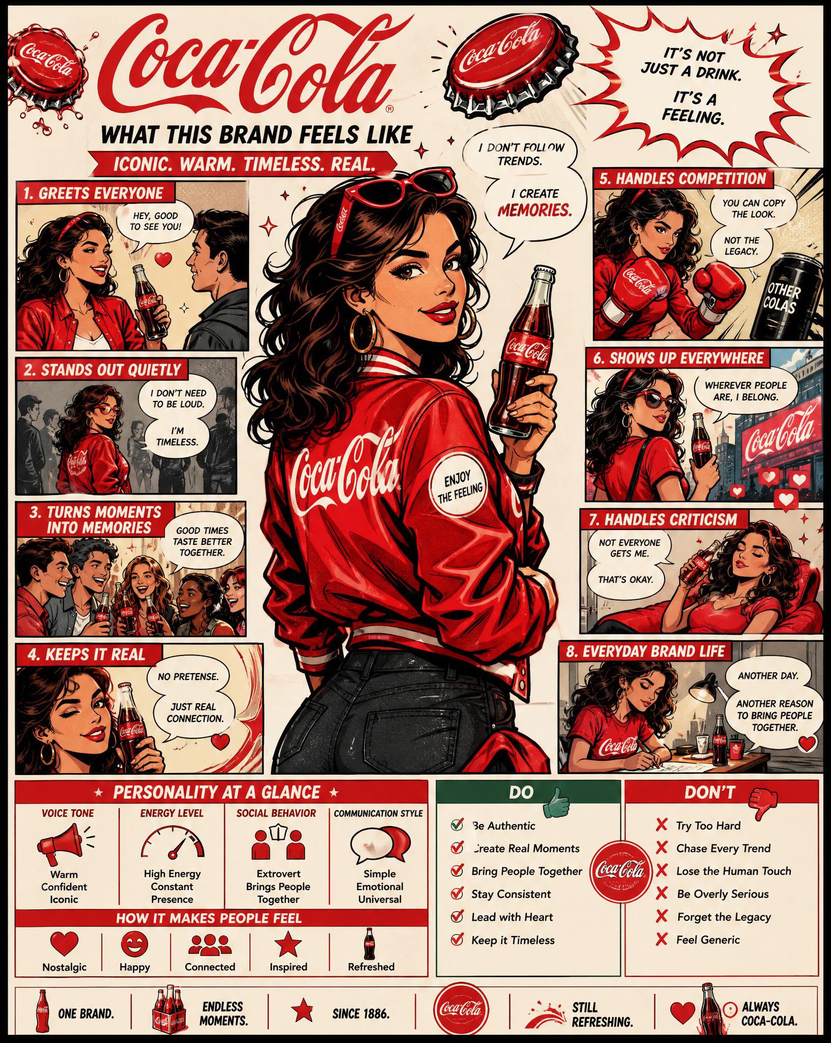
💡 提示词说明:本卡片提供高精度的 AIGC 生图咒语,点击下方 “Copy Prompt” 按钮即可一键复制原始英文提示词使用。
🔮 画面意境解析 (Prompt Translation)
AI 智能生成的艺术绘图提示词《例379 – 品牌人格漫画信息图》,呈现宏大唯美的视觉质感。
🧩 结构化咒语拆解 (Structure Breakdown)
- 主体 (Subject): 根据 Prompt 自动生成画面主体
- 环境与背景 (Environment): 根据 Prompt 自动构筑光影背景
- 画风与光效 (Style & Light): 写实 / 3D / 插画艺术风格
🛠️ 避坑与参数建议 (Parameters & Tips)
推荐使用 Midjourney v6.0 或 Flux 1.0 模型生成,建议参数 –ar 9:16 –v 6.0
❓ 常见问题解答(FAQ)
品牌人格漫画信息图提示词怎么写?
先明确“只从Logo提取颜色和人格”,再规定4:5竖版、中心角色、6–8个分镜、人格标签和DO/DON’T区块。这样能把品牌策略、角色设计和漫画叙事合成一张高密度海报。
这种AI生图咒语适合什么品牌?
适合任何已有Logo、希望强化品牌识别和人格表达的品牌,尤其是需要做品牌海报、社媒视觉、品牌手册或活动KV的场景。关键是Logo本身要有清晰色彩与气质线索。
为什么提示词强调不要泛化人格?
因为泛化会让结果变成通用营销海报,失去品牌独特性。该提示词要求所有设定都来自Logo,能让角色外观、语气、动作和分镜都保持一致,更像“品牌本身在说话”。
🔬 语宙深潜追问 · 进阶实操拆解
品牌Logo转人格时最关键的起点是什么?
先从Logo颜色、几何感和气质提炼人格关键词,再决定角色年龄、表情和服装。不要先想“像谁”,而要先想“品牌是什么性格”,否则很容易做成泛化的卡通形象。
分镜式信息图怎样兼顾密度与可读性?
每格只讲一个人格证据点,配短句而不是长段说明。统一线条、色块和视线方向,信息层级就会清楚;如果内容过多,可把辅助说明放到边栏,主画面只保留最强记忆点。
🗳️ 读者观点微投票 · 您的实战立场是?
品牌人格漫画图更适合策略还是传播?


